Case study
Creation of the Responsive version of the website
Dulux

Context
Dulux had a corporate website and wanted to offer a new & better experience to their loyal customers.
Challenge
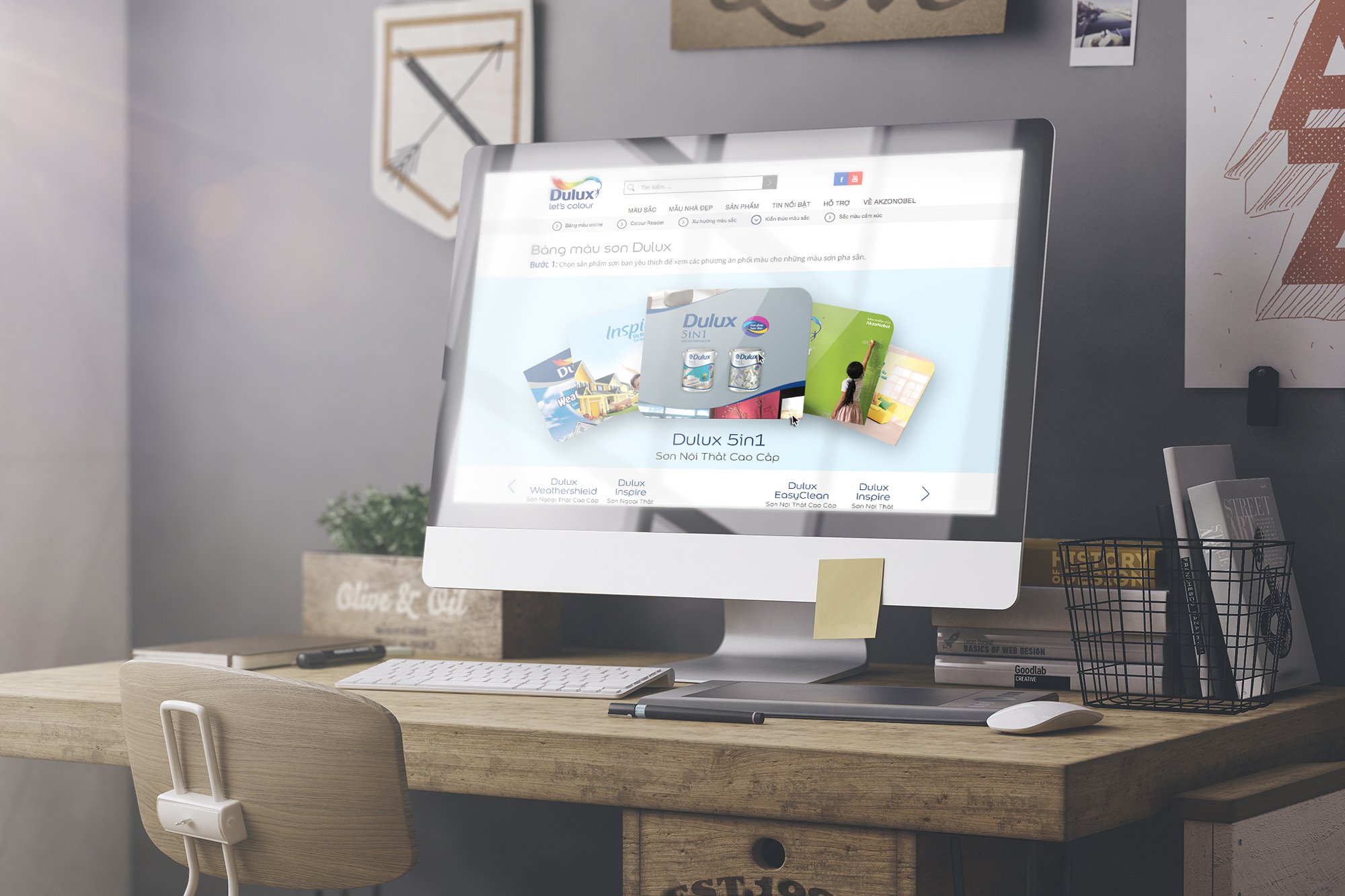
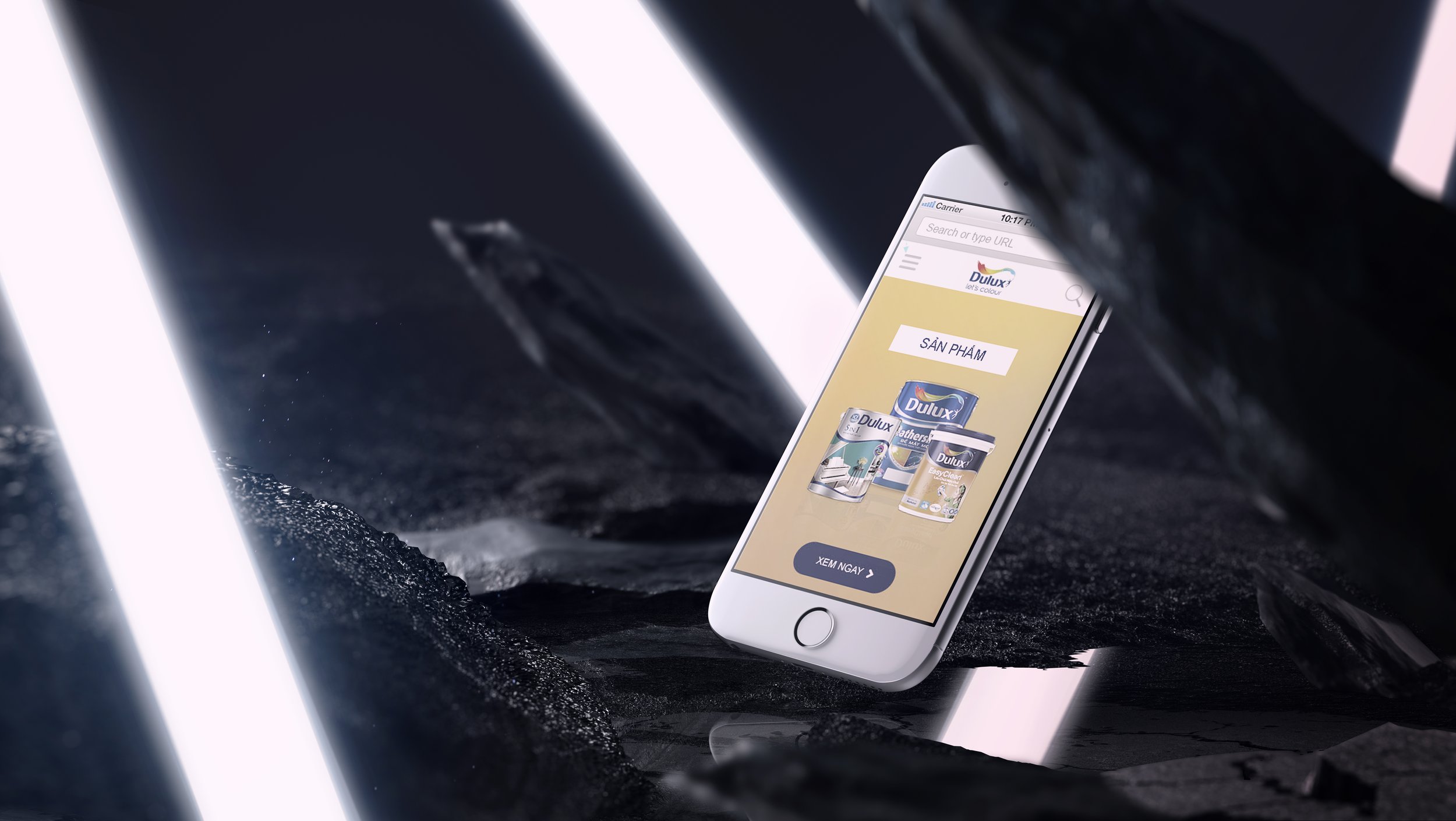
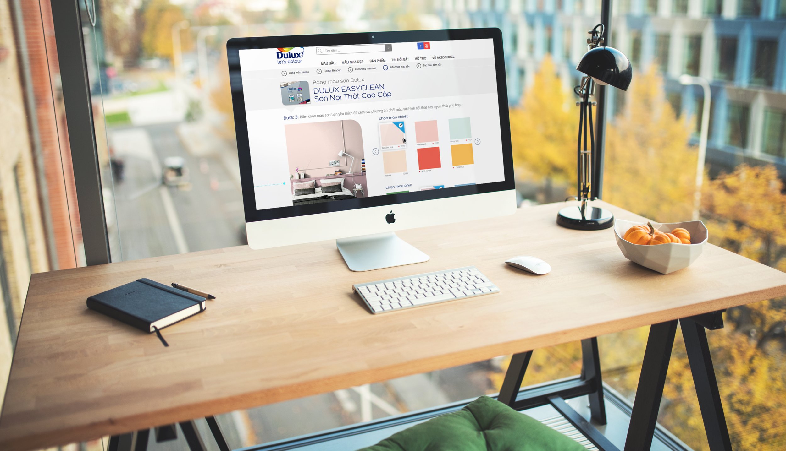
It was the right time for the website to move to the next level. The challenges were to offer a much better navigation experience on mobile (making the website becoming responsive) and the possibility for users to purchase Dulux products online. A shift was needed, moving from a “User Experience” (UX) to a “Customer Experience” (CX) approach.
the
Approach
“Different, but same same”. Digital is often associated with transformation, but no one likes brutal transformation, especially when it comes to loyal consumers and their habits (both purchasing and consumption). A mobile version of a website has its own codes. That’s why we suggested some recommendations in order to improve the desktop/laptop version of the website. In fact, it allowed us to create a kind of transition, a gradual transformation and education of the users toward the new mobile version. So rather than a revolution, we wanted Dulux customers experience an evolution.
Obviously, the client is the one who pays. But it doesn’t means we have to say “Yes” to all their requests. In fact, the client also pays us to put ourselves in the customers’ shoes. This is what it means.
The experience on mobile is not the same as the one on desktop. Sometimes we even forget “mobile” means being in situation of mobility.
From a user’s POV, when we use a phone, our mindset is different. We expect a different surf experience, and most of the time in fact we don’t expect more but… less. We expect less information, we expect the essential so we can find easily and quickly what we want, need or look for.
From a client’’s POV, they want to show to the world all information and great products/services they have offered.
But in marketing and communication, timing is key. On situation of mobility, it’s not the right time to display all information. The challenge is to convince the client to let it go, because it’s about making sacrifices. It’s one of the strategies of Apple when they design their computers/laptops/devices. Note: that’s why, year after year their products lost usb c ports, jack ports etc. As someone said: “The job of a good Designer is not to add. It’s to remove”.
So the mobile version of a website is not a copycat of the desktop/laptop version. The approach is more about offering right elements at the right time.
To present a project, creating interactive prototypes with InVision, Sketch or XD is great because it engages the client. It’s the functional part of the proposal. However, I believe the emotional aspect is crucial as well. That’s why I used to recommend going the extra mile by bringing to live the design in a demo video. An effective demo video is not about, to show off how good our design is, but showing how the end-consumers feel good, enjoying our solution.
Rich Banner
Ideas usually start with a sketch
(even you have no idea about what you are doing at first).

Extended reach banner.
Relevancy is crucial when it comes to catch people’s attention. In this case, user interacts with the ad.
Painting entirely the wall reveals the message.
The last phase allows Delux to nurture it’s data base with qualified leads.

Credits
Agency: Mekong
Creative Director: mynkao
Art Director: Duc
Copywriter: Kim
Head of Planning: Nhat
Advertiser’s website:
dulux.com.vn
